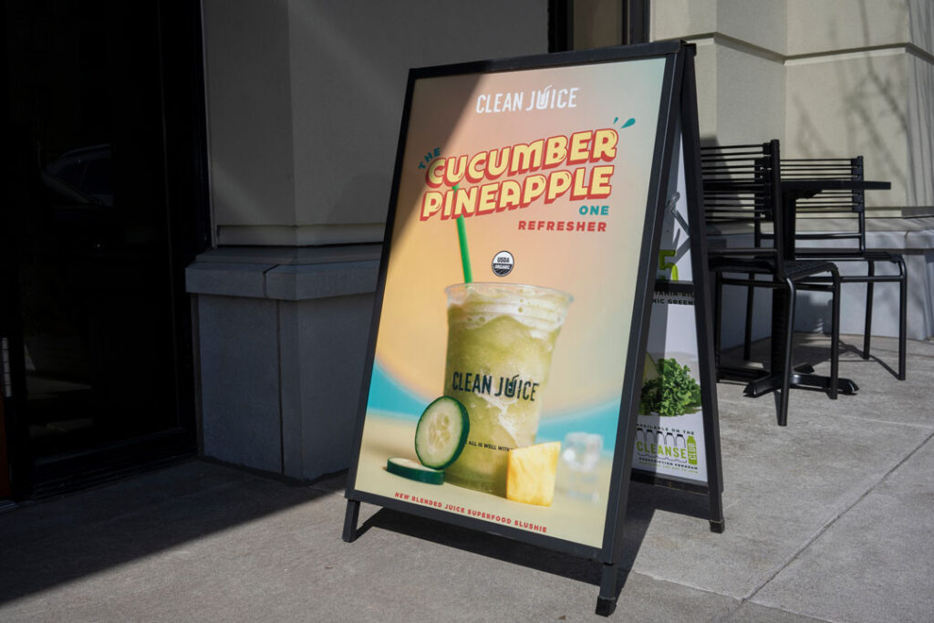
Tips to Create Attention-Grabbing Sidewalk Signs

Effective sidewalk signs can be extremely effective at grabbing customers’ attention if done right. So how do you do that? In this article, we’ll share 4 tips that will guarantee your sidewalk signs get the attention you want and generate more overall visibility, engagement, and sales.
Sidewalk Sign Tip 1 – Focus on Design
A visually striking design is key when designing a sidewalk sign. Consider incorporating the following design elements to ensure your sign stands out:
- High Contrast
- Bold / Bright Coloring
- Large Font & Lettering
- Not “Busy” or Cluttered
If you follow some of Graphic Solution Group’s foundational design elements here, you’ll already be doing better than most companies. But you’ll really stand out if you add a brand-integrated design, trending details relevant to your target audience, or flashy finishing.
Sidewalk Sign Tip 2 – Have a Strong Message / Offer
You’ll generate more engagement, activity, and sales if you have a strong offer. That formula is pretty simple. But what actually makes for a strong offer? Let’s look at a few elements of an offer that will indeed have your sidewalk sign moving more customers in your direction.
Elements of a strong offer
- Ensure any listed price is competitive
- Share added value (Can you give more than your competitors?)
- Make sure you are solving a problem your customers face (and share that!)
- Be bold and “to the point” (don’t mask the offer in a timid or shy way)
Sidewalk Sign Tip 3 – Include a Call to Action
This is a big one. You have to ensure you direct the customer on what to do next.
If you want them to call, say that and share your phone number. If you want them to visit a website, highlight the URL or QR code they can access quickly. Do you want them to walk into your store? Then tell them to COME IN!
It sounds pretty obvious, but you’d be surprised how many designers and business owners don’t include a call to action but instead have a passive message that either doesn’t have any action associated with it or the call to action is implied. Either way, do not do it. Be explicit and get your customers to take action.
Sidewalk Sign Tip 4 – Make it Interactive
This can be fun if you make your sidewalk sign interactive. How do you do that? Well, there are several popular ways successful businesses are making that happen.
- Use QR Codes
We mentioned this earlier, but QR codes are a quick and easy way to make your sidewalk signs interactive. It transports customers from their phones to your site, landing page, or app and gets them engaged immediately. - Include Takeaways
You can have sidewalk signs with mounted attachments that provide items customers can take with them (or “take away”). An excellent example of this is real estate sign info boxes. You can do something similar for your business. Or get even more creative and make it more relevant to your customers. - Touch Elements
This one is slightly different because it captivates our desire to touch or manipulate things. We see that just “beg” to be messed with. Items such as balloons or spinners are perfect because they draw visual attention. Still, they physically draw us in to check them out even more, to touch them, spin them, flick, or whatever creative object you decide to use for your business. Trust us. It works!
Using these tips on what you can include on your sidewalk signs will most definitely get more attention and ensure that your business doesn’t get “lost in the crowd” or simply blend in. If you’re looking to have new attention grabbing sidewalk signs created for your business, then let’s talk!
Contact Us for More Information
Are you looking for a printer who can help you meet your deadlines?
Then your in the right place! Have any questions or concerns we would love to hear from you.
Please submit your information in this form and a sales professional will reach out to you.
Want to Speak to a Sales Representative? Call 770-424-2300


